Mixing prints can seem scary, but it can make any room look elegant. The trick is to find the right mix of patterns, textures, and colors.
Understanding the basics of mixing prints is key to a beautiful space. It’s about pairing bold prints with soft ones and matching colors for a nice look.
Learning to mix prints well can make your rooms stand out. It adds depth and interest, making your home truly special.
Key Takeaways
- Understand the importance of scale in mixing prints
- Learn how to coordinate colors for a harmonious palette
- Discover how to balance bold prints with subtle ones
- Get tips on creating a visually stunning space
- Explore the art of mixing prints to add depth to your rooms
Understanding the Basics of Print Mixing
Learning about print mixing is key for those who want to spice up their homes. It might seem scary, but with some basic rules, it’s easy to use in decorating.
Why Mixing Prints is Important
Mixing prints brings depth and interest to any room. A good mix can make a space look stylish and sophisticated. It lets homeowners show their style and create a special vibe.
The Role of Scale in Prints
The size of prints matters a lot in mixing patterns. Minnie Claridge suggests using a mix of small, medium, and large patterns. This balance makes the room look good.
- Small patterns add detail without being too much.
- Medium patterns act as a bridge between small and large.
- Large patterns make a big impact and can be the room’s centerpiece.
Color Coordination Principles
Matching colors is key when mixing prints. A cohesive color scheme is essential to link different patterns. Choose a main color and pick patterns that go well with it.
By grasping these basics, homeowners can mix prints with confidence. This way, they can make their home both stylish and a true reflection of themselves.
Do’s of Mixing Prints in Your Space
Mixing prints can make your space stylish and interesting. It’s all about knowing a few simple rules. By following these guidelines, you can make a room that shows off your unique style.
Choose a Common Color Palette
Start with three to five colors that go well together. Pick a main color to center your design around. This keeps your space looking neat and organized.
Tip: Pick a few main colors first. Then, find prints that match these colors.
| Color Palette | Print Options | Result |
|---|---|---|
| Monochromatic Blues | Stripes, Florals, Geometric | Cohesive and Calming |
| Earth Tones | Leaf Patterns, Abstracts, Textured | Warm and Inviting |
| Bold and Bright | Polka Dots, Chevrons, Florals | Energetic and Playful |
Balance Bold Prints with Subtle Ones
It’s important to mix bold and subtle prints for balance. Bold prints are big and bright, while subtle ones are smaller and less bold.
For example: A bold floral sofa looks great with a subtle striped armchair.
Use Varying Print Sizes
Using different print sizes makes your space more interesting. Mixing big, medium, and small prints keeps things lively.
- Large prints are perfect for big pieces, like a bold rug or a large sofa.
- Medium prints are good for chairs, throw pillows, or curtains.
- Small prints are great for accessories like vases, coasters, or small blankets.
By following these tips, you can make a stylish and balanced space that reflects your taste.
Don’ts of Mixing Prints in Home Decor
To make your home look great, it’s key to know what not to do with prints. Mixing prints can make your decor pop, but some mistakes can make it look messy.
Avoid Overwhelming Patterns
Don’t let too many patterns overwhelm your space. It’s important to mix bold prints with solid colors or soft textures. This keeps your room from feeling too busy and lets each print shine.
For example, pairing a bold geometric print with a neutral solid can look amazing. The goal is to make sure not everything in the room is fighting for attention.
Don’t Match Everything Exactly
While it’s good to have something in common, don’t match everything exactly. This can make your space look too uniform. Instead, aim for a look that feels cohesive but varied.
Start with a main print and pick others that share a color or style. This way, you keep things connected without making everything look the same.
Stay Clear of Clashing Styles
Clashing styles can ruin a beautifully decorated room. Be careful when mixing different styles. For instance, modern prints with vintage or bohemian styles can work if done right.
The trick is to find something that ties all the styles together. This could be a shared color, texture, or era. By doing this, you create a space that’s both unique and reflects your style.
| Common Mistakes | How to Avoid |
|---|---|
| Overwhelming patterns | Balance bold prints with solids and subtle textures |
| Matching everything exactly | Use a common color palette or theme for cohesion |
| Clashing styles | Find a common ground among different styles |
Practical Tips for Effective Mixing
Mixing prints successfully is all about a few simple strategies. Use these tips to make your space stylish and harmonious.
Start Small with Accessories
Start with accessories like throw pillows, blankets, or vases. They’re easy to change and let you try out different patterns. For example, try a striped pillow with a geometric blanket. This way, you can see what works for your space.
Experiment with Textiles
Textiles are a great place to play with print mixing. Mix fabrics like velvet, linen, or cotton in various patterns. For instance, a floral patterned sofa with a striped armchair looks amazing. Feel free to mix textures and patterns for a unique look.
Consider the Room’s Overall Theme
When mixing prints, think about the room’s theme and style. Choose prints that fit the room’s decor for a cohesive look. For example, modern rooms do well with geometric patterns, while traditional rooms look great with classic florals. This way, you can pick the right prints and balance them well.
Follow these tips to become a pro at print mixing. You’ll create a home that’s both beautiful and shows off your style.
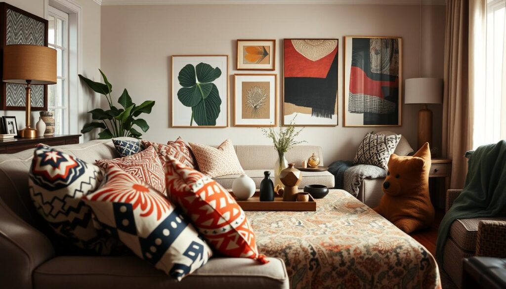
Examples of Successful Print Mixing
Effective print mixing can make any room look better. It creates a space that is both beautiful and balanced. By using different patterns, textures, and sizes, you can add depth and personality to your decor.
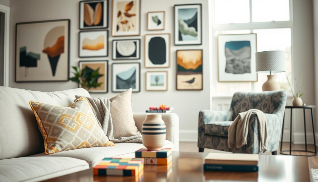
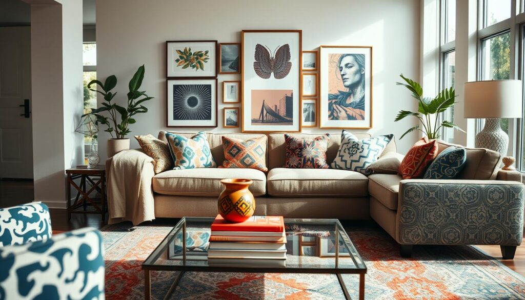
Living Room Inspirations
In living rooms, you can mix prints by pairing a bold geometric sofa with neutral armchairs. Add a vibrant floral rug for a stylish touch. This mix of patterns and colors is a great way to decorate your space.
Bedroom Print Combinations
In bedrooms, try pairing a delicate duvet cover with a bold, striped wall. Add subtle throw pillows for a cozy feel. This combination shows how to mix prints for a soothing and stylish bedroom.
Tips for Mixing Prints in Kitchen Decor
In kitchens, mix prints by using a bold tablecloth with subtle tiles and patterned accessories. This mix creates a unique and interesting look. It’s a great way to add personality to your kitchen.
FAQ
What are the key elements to consider when mixing prints in home decor?
When mixing prints, focus on a common color palette. Balance bold and subtle prints. Use different print sizes for a stylish space.
How do I choose a common color palette for mixing prints?
To pick a common color palette, choose a few core colors that go well together. Use these colors as the base for your print mixing. This will make your space look cohesive and not too busy.
What are some common mistakes to avoid when mixing prints?
Avoid overwhelming patterns and matching everything exactly. Also, don’t clash styles. Balance bold prints with subtle ones and think about the room’s theme.
How can I start mixing prints in my home decor?
Begin with small print-mixed accessories like throw pillows or blankets. Try different textiles, like rugs and upholstery. This will help you get better at mixing prints and make your space stylish.
Can I mix prints in any room, including the kitchen?
Yes, you can mix prints in any room, including the kitchen. Think about the room’s theme and balance bold prints with subtle ones. For example, pair a bold kitchen rug with subtle print curtains or a stylish wallpaper with a patterned backsplash.
How do I balance bold prints with subtle ones?
To balance bold prints with subtle ones, pair a statement piece like a bold rug or wallpaper with simpler elements. For example, a bold rug can go with a simple throw pillow or a solid-colored sofa. This creates a harmonious and appealing space.